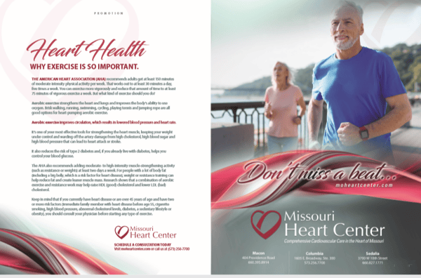
If you have ever been flipping through a magazine and find yourself pausing to look at an article or ad that spans across two pages, you’re responding to the unique design flow of a two-page spread. Designers for magazine articles use them all the time to create a seamless reading experience from one page to the next. Designers also understand that a spread is more memorable, as it’s a break from the traditional single page format. Advertisers can use the same strategy! Less commonly used than the more traditional ad sizes, advertising that uses a 2-page spread creates a campaign that jumps out and grabs a reader’s attention faster and with greater memory recall later on. Here’s how and why:
What is a Two-Page Spread?
A two-page spread is simply two pages next to each other in a magazine. The industry term for this is a “double truck.” Each page works together as a single unit and opens up some fun and exciting design opportunities. There is a common misconception that a spread is two pages separated, but it’s actually two facing pages with content that flows seamlessly between the two sides. A two-page spread works together as one cohesive eye-catching element, even if the information differs on each page.
When is it Used?
You can use them any time you want to break a reader’s attention from the routine flow of single page ads. They capture “eyeball time” easier than a regularly positioned ad. Best used when you have a lot of content, it’s easier for readers to digest the content in a longer format as opposed to cramming it all into one page or smaller ad and overwhelming the reader. These are more commonly used in educational pieces, ad campaigns where there is a lot of information to share, or when a business has a new product they want the reader to learn more about. Two page spreads can also be a great way to position yourself as an industry thought-leader or reliable resource.

Two-Page Spreads and Advertorials
Advertorials are advertising that gives information to the reader in a format similar to editorial content. They are meant to be educational and explain what the content and subject entails. They are sometimes referred to as native advertising. Have you ever seen a large magazine-like headline with bright eye-catching graphics or photos? That was most likely an advertorial. It gives a more in-depth look into the product or service you are trying to convey. Having 2 pages to play with in a spread gives you, creatively, more space to do both an advertorial AND a “regular” ad. We’ve seen some really great ad campaigns that combine both.
Benefits of a Two Page Spread:
- Eye Catching
- Easier Readability
- Balance between images and text
- Readers will not feel overwhelmed with information
- Higher visibility
- Builds brand awareness
- Because of increased memorability, advertising success also increases
Final Takeaways
If you really want to stand out and be memorable, a 2-page spread - or double truck - is the way to go. They’re a perfect way to position your business as an industry leader or launch a new product or service. If you want to build brand awareness and generate more leads, this is a powerful advertising tool that will make your business stand out from the crowd. Price-wise, they are typically discounted from the price of 2 full separate pages, and for the increase in reader attention, it may be well worth the added investment.
